Tuesday, May 29, 2012

Business Builders' Swap

New Stampin' Up! Product

 This month our Business Builder group had a swap.  We each produced 3 different cards using only products that are new or will be carried over into the 2012/2013 catalog.  I am posting mine below.  I usually will find a card on the internet that I like and tweak it a little, using different colors, stamps, paper, etc.  This month I came up with my own cards without looking for inspiration from others.

The first is a simple Congratulations card.  I used DSP from the Floral District set as well as the new Layered Labels stamp and Apothecary Accents Framelit.  The rest is using existing product that will carry over.

The next card uses the Papaya Cottage stamp set.  The beautiful rose as well as the Comfort Cafe DSP I used and the Victoria ribbon give a Victorian/vintage look to the card.  The words also come from a new set called Memorable Moments.  This is a great set, because the Happy and the Birthday are both separate stamps.  There is also Anniversary as well as numbers that come with this set. You can mix and match and really customize your stamps.  Using it with the clear mount makes it really easy to line up the words and numbers. 


The third card is my favorite.  Although it is a little more work than the others, the results were well worth it.  I used markers to color the stamp which gave it a gradient look.  My daughter helped me pick out the paper color combination and the wording.  I think we make a fabulous team!

The next swap I am involved in is a shaker card.  I came up with it in the middle of the night...waking up with a "Eureka" moment.  I can't wait to share it with you after the trade in June.

Thursday, May 24, 2012

Same Color Combination and Components Can Be Used To Make Different Looking Cards

When you create a card, your creation should not end there.  Just a few tweaks to the card can make it appear very different.  If you are a demonstrator, you are well aware of this because, despite the fact that you bring only specific colors or paper and ink to a private stamp-a-stack or workshop, if your class consists of young (or young at heart) people, each will create a different looking card.
Just changing the placement of items on a card, or the orientation of the card, can give the card a different look and feel. 
Also, changing the colors around will give you a different feel as well.
This card is designed with a blue and white color scheme using the new Betsy's Blossoms stamp set from Stampin' Up!  A 1 inch strip of embossed Whisper White card stock (using the Big Shot and the Polka Dot Embossing Folder) is used to give the card base some depth, and the card base was also embossed using the designer frames folder.  5 blossoms were stamped and cut out.  When stamping, I gently randomly wiped off some of the ink so the blossoms would not be "perfect", but would show some gradation in color.  I also placed a Rhinestone Basic Jewel in the center of each blossom.  This is a very simple, quick card to prepare. 
I took the same concept, but switched the colors around.  What was once dark blue is now white and what was once white is now dark blue.  In order to get the white, I used the white embossing powder and Versamark ink.  I have also moved the focal point to the top of the card.

Next, I stayed with the blue and white color combination but mixed it up a bit.  I also changed it to a landscape vs. portrait lay out. 
As you can see, one design can be slightly tweaked and present an entirely new look.  Using totally different colors will present very different cards as well.  We will look at that in a future blog.  Using the same design but a different stamp would make the second care a nice masculine birthday card. (Maybe I will remember to do that in a different blog as well!)
Remember, when you create a design, you can just use a little extra thought and re-create a very different look and feel to the card.

Friday, May 11, 2012

Gift Card Holder
This gift card holder can be put onto any card you make, making it very versatile and quick.  One sheet of 8 1/2 X 11 paper produces 3 holders.  Make all three when you need one and the other two will be ready for you when you need them.  You can use them on your hand made cards or even on store bought cards.

Supplies:

8 1/2 X 11 piece of card stock of your choice
Scoring tool
Cutting tool
Adhesive

Procedure:

Step 1

Cut an 8 1/2 X 11 piece of card stock into three 10 1/2 X 2 1/2 pieces.  Set 2 aside and repeat the following procedures on them as well.

Step 2

Score a piece of 10 1/2 X 2 1/2 piece of cardstock at the 3 1/2 and 7 inch points, then turn it 90 degrees and score at 1/2 inch along the long side.

Step 3

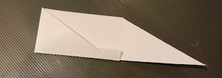
You should have 6 sections on your card stock.  Three larger and three smaller, narrow sections.  Cut out the two outer thin sections.


Step 4

Next you will cut the angles on the outer large sections.  Line up the card stock on a cutter so that it cuts from the bottom exterior corner (where the small piece was cut out) to the top edge at the 3 1/2 inch point where the score mark is.  Cut.  Then line up the exterior bottom right corner (where the small piece was cut out) and the outer edge at the 7 inch mark and cut.


Step 5

Fold up the center thin bottom section.


Step 6

Run a bead of glue, or use snail adhesive (what I did) along the bottom rim of the left triangle piece.  Fold so that it adheres to the folded up thin piece.  Do the same with the right triangle piece to finish the holder.


Step 7

Use adhesive to attach to the inside of a card.
Step 8


Insert Gift Card into holder and you are ready to send the card!


This is my first attempt at a pictorial tutorial.  Hopefully my picture taking skills will improve with time, but this is such a simple project that I am sure you will easily understand the steps!
I hope you enjoyed it and enjoy using the holder in the future!


Wednesday, May 2, 2012


Kathleen Kennedy
(434)525-0294
maierken@yahoo.com


I am attempting a new way of sending out mymonthly email newsletters, using the pre-made information from Stampin' Up! and adding some of my own information.

Many Items Retiring!!
This is the last month of the 2011/2012 catalog.  There are many retiring items, some of them are even discounted, so check out my site if you want to scoop up any retiring products or great deals! 

CHECK OUT MY BLOG!
Also, I have started a blog for my business.  If you are interested in following my blog, making suggestions, learning new techniques, etc., please go to my blog site:    http://creativestampingwithkathy.blogspot.com/

JOIN ME IN A STAMP-A-STACK!
    There are many reasons to join in a stamp-a-stack - Learn how to craft with paper, enjoy the fellowship of other crafters, just use the time as "me" time, or come in order to take home cards to use in the future.  Also, if you don't have time to craft at home so don't want to purchase supplies but enjoy crafting, a stamp-a-stack is perfect for you.
   If you are interested in my schedule, attending a class, having a workshop with your friends, having a stamp-a-stack with your friends, or attending a business meeting, please visit my Stampin' Up! web site by clicking on "visit my site" at the top of the newsletter.
   In an attempt to introduce the product and the fun of crafting to as many people as I can, I am offering a 2 for 1 on all of the stamp-a-stacks held at my house.  Bring a friend and she/he gets in for free (or you can split the cost of the class and both get in for half price!)  Stamp-a-Stacks are $15 per person for 6 cards....or 4 cards and 4 3-D items.  This requires pre-registration and pre-payment to guarantee your spot is held.  It also requires that you bring your own adhesive, such as TomBow and/or snail adhesive.  If you don't have any, I will have some for you to purchase.

ATTEND THE INTRODUCTION TO STAMPING CLASS
Intro to stamping classes are free, with a quick introduction and a make-and take of a card and/or 3-d item.